Hello Comdex Fam,
I have 2 suggestion for you.
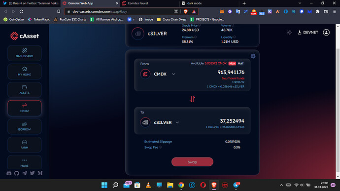
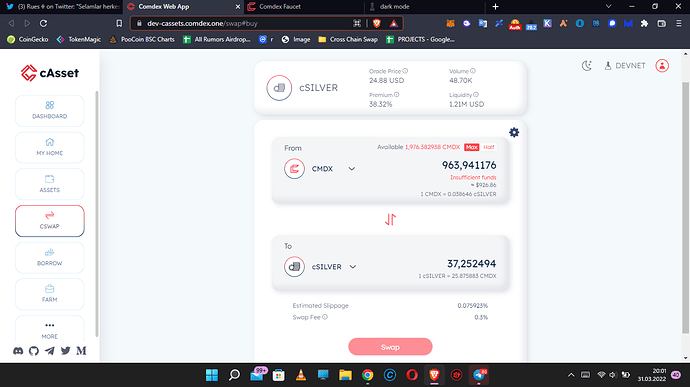
The first one is about max button on swap section. Whenever I use this option I face up with insufficient balance error
The other one is about dark/light mode. When random user get inside of https://dev-cassets.comdex.one/ it appears as light mode and it is really complex for user. Harmony of colours is really not cool. It leads complexibility. But the dark mode is really hilarious. My suggestion is dark mode should be opening page of the comdex.
Firstly look at dark mode and then light mode and choose your side.Thanks to take it into consideration.
Bestwishes

